Friday, December 15, 2017

My New Portfolio!

This is by far my favorite project we've ever done. All the pre-projects really helped understand what I was doing and gave me some good and bad examples of what my page should look like. As soon as I made the design pre-project, I fell in love with the one page portfolios and how easy they flow and explain what you do without overwhelming the viewer. I also figured out that I love animations and transitions, so that was something I for sure wanted to include in my portfolio because I found it super interesting and it spiced up the page a bit.

Alright so. When I first started this project, I was still super excited about it. I knew it'd be a little easier then the others and I get more creative freedom with it. Still, there were some definite obstacles in the way. When trying to figure out my name on the starting page, there was originally a slogan in there, but it all looked too clashing with the buildings and you couldn't read it that much. Okay so now you have just you're name and that still overlaps the building and looks weird. I played around with the different css files and figured out how to change the div, but I'm still not sure if I should put a slogan on. I don't know if it's beneficial or not.

In the end, I'm really happy with my portfolio and I really do think it accurately represents the modern aspect that I'm going for when doing client sites. It represents me as a web designer, and more importantly, it shows where I come from, Kansas City. Home of the royals and home of Ava Yerkes, freelance web designer.

To visit my site, click this link: Ava's Portfolio

Monday, November 27, 2017

TV25 Review

TV25 was an interesting project, and probably a client project that I learned most with, even though I never actually worked 1 on 1 with him. We started off with a basic client meeting, which went really well in my opinion, and I created my sketch to the side. I was proud of this sketch and soon made a mock up of my site, which turned out differently then expected, but still cool and professional. Then our client came back and took a look at our sites, wasn't too impressed with mine, and just kind of skipped past it and then suggested other out-of-the-box ideas that seemed impossible (or took a long time to make). After that, I got another client, and figured he wouldn't pick my site anyway, butt still made a site nonetheless. I like my site, there's defiantly some things to fix, such as he wanted something for deals to slide through on, his social media, but I felt I didn't have enough time to make everything he wanted it to be. Overall, this was a fun project, and a good learning experience with a client that has different tastes then you do. See my site here: TV25


Friday, September 8, 2017

Logo 2.0


These are my two final logos. I really liked the more feminine feel to it, especially since gymnastics in more targeted towards girls. I liked the darker purple originally because it just appealed more to me and makes it seem more sophisticated and not too kiddish, and that's what I feel when looking at the lighter pink. I feel that the darker purple will give off a good impression about the business and that any ages are welcome, rather then just little girls.


Wednesday, September 6, 2017

New Logo

These are my newly revised logos. The comments I got really liked these two logos in particular, and most of them also said to try out different fonts for the word sports, although I ended up still liking my original one the best. None of them really appealed to me too much, and I couldn't find any fonts that I was crazy about. Nonetheless, I still tried some other ones. Let me know what your thoughts are.

Tuesday, September 5, 2017

Sam's Sports

Sam's Sports is a gymnastics place. At first, I went for real fonts and then I started drawing them on my own. I did a signature type font and really liked how that looked, but also tried curly ends and really liked how it looked like a ribbon in rhythmic gymnastics. 

Friday, August 25, 2017

Wordpress vs Wordpress

Wordpress.org
  • You host the server
  • You pay for your server and have to keep the web server (Wordpress.org itself is free to use though)
  • You get your own domain name
  • You get more flexibility, range, and options (plug-ins, themes, and code)
  • You can add in ads and make money from it
  • Recommended by a majority of websites over Wordpress.com

Wordpress.com
  • Wordpress hosts the server
  • Cheaper/free
  • Domain name includes Wordpress.com
  • Can't have custom themes
  • Hosting service ranges from $36-$5000 a month 
  • Automatically backs your website up for you
  • There is ads on your page, but you don't get money from it
  • You can't see any statistics of your page
  • They have the power to delete at any time if they think it goes against their policy
Conclusion: Most websites prefer Wordpress.org because it's gives you more free range to do whatever you want, and in the end it's probably cheaper then Wordpress.com, you just need to keep up the site yourself. 
Sources: themes.com, wpbeginner.com

Tuesday, August 22, 2017

House Locator Software


Throughout this journey on finding software for Mr. Map Builder Guy (MBG for short), I found many shortcuts and secrets that companies use to make their businesses accessible to customers. One of the companies I took a look at was Apple, and they made their own map unlike the other companies. I looked more into their source code and found that they used separate divs for everything, and mostly separated all the locations using column divs. Before any tag, ac-ls and then whatever they wanted to happen then would appear. Here's an example: 
id="ac-ls-dropdown-options" class="ac-ls-dropdown-options" role="menu" aria-expanded="false">. Even tags that weren't divs had "ac-ls", so I'm thinking that's the code word that connects it all together.


 Now for Zillow and Walmart. The both actually just connected their site to bing or google, which sounds like a much more reliable and easier way to go about it. Sites like Walmart can let google do all the work because the site hours and locations are already connected through Google, so when Walmart connected it, they just needed to make a few tweaks with the popups and they were good to go. Now what Zillow did with Bing is what we would be doing more realistically because we're dealing with houses as well. Having individually dots for MGB's customers and having the ability to search, zoom, and pop up names will make things easy to find and use for MGB. Also, if Zillow wanted to add something to their map, a tag named bing attribution would be added to have that flexibility of adding some of your own things. Something I learned from Zillow that I knew was that whenever you hover over a certain dot (house) it will automatically send that dot above the other ones and push the other ones behind it.

Thursday, May 25, 2017

Final Reflection


Web Design Final Reflection

Technology

Technology is one of the biggest aspects of eComm, and the biggest thing I took from it was how to fluently use adobe suites. It started in Graphic Design my freshmen year when we started Illustrator and Photoshop, and as the years have gone on and I’ve used them more and more they’ve gotten easier to use and I’m using new tools to create advanced graphics or web sites. These skills come in handy when making a website because if you’re making a mockup for a client or just doing a project, you can quickly and efficiently make something and put it in your website. Of course there were challenges and struggles when I didn’t know how to use a certain tool, but that’s all apart of the learning process and it helps me become more efficient in those tools specifically because I got more help on them.

Collaboration


Collaboration is one of my strongest suits out of all these categories. I use it daily when helping (or talking) to my peers and even working together to make suggestions to our websites. Of course, collaboration can also be viewed in the negative when you’re talking too much and not collaborating on work but rather just talking.

Communication


Communication is another one of my strong suits because our specific web design class is generally really close and friendly with each other so we don’t have a problem asking each other for help when we need it or just asking for advice and feedback on something.

Project Management


I’ve found myself struggling with project management more this year than ever. Last year, I was so on top of it and everything was done in advance, and this year I’m still getting things in on time but I’ve found myself having more crunch time during projects when I just need to block off other people and work in order to get it done on time. Management comes in handy in pretty much any and every job position you’ll hold in the future, because you’re always going to have a deadline in something and you’re always going to need to have long nights and early mornings in order to get it done.

Leadership


I mainly learned leadership freshmen year during the 4th quarter project and working together to create a project. It was hard adjusting to new people in a new environment, but it really helped broaden my horizons and become more comfortable with Olathe Northwest and e-Comm in general.

Greatest Strength &Weakness


My greatest strength has to be communicating and leadership, while my worst one is getting distracted easily. If I’m by myself, I’ll get things done so fast but if someone starts talking to me I get sidetracked and before I know it, 20 minutes has passed (maybe that’s the reason for my time crunching problem in time management…) I’ve definitely improved throughout the last couple years in all of these aspects and I’m going to continue growing next year and hopefully after that.


What Now?


I’m going to take what I’ve learned these past three years and apply it all on my senior year and try to make my websites better as well as preparing for senior show and eMagine and going out with a bang. If I had to change anything, it would be nothing. Web design has been my happy source for 3 years and if I had to go back I would change absolutely nothing. Sure there’s been struggles, but that’s just a bumpy road through life and it helps get to your main goal in the end.

In conclusion, eComm has been and will be the best experience of my high school career. It taught me so many things about technology and future clients that I know will come in handy later on in the future, even if I don’t do anything website related.

Monday, May 22, 2017

Texture in Web Design

In this tutorial, texture and depth are explained in a way that makes websites easier to use and makes it less boring and more exciting. Texture is all about grouping things, grabbing attention, making content more legible, have purpose, and highlighting certain aspects of your website that's important and that you want to make stand out.

Link to the Tutorial: Smashing Magazine


  • First tip - "Maintain Legibility", meaning do not emphasis textures too much to where you can't understand them
  • Second tip - "Don't Beat a Dead Horse", meaning don't overuse textures
  • Third tip - "Practice Means Improvement", meaning to branch out and try new things with texture, but don't go too far with it
  • Fourth tip - "If it Serves No Purpose, Take it Out", this goes along with keeping as little content as possible so you don't lose the audience's attention. Keep everything simple and make sure it goes with the theme you already have
  • Fifth tip - "Consider the Effect You are Trying to Achieve", keep in mind your original vision of this and not to do too much texture
  • Sixth tip - "Collect Resources so You Don't Have to Search Later", keep ALL textures you have that might come in handy later for this project or for different projects
  • Seventh tip - "Learn Masks", just as it says, learn how to control masks in photoshop
  • Eighth tip - "Don't Sacrifice Quality for Loading Time" be quick, but keep the texture you're trying to create and not going overboard with it
  • Ninth tip - "Choose Textures Logically" go along with the color schemes and the layout of the website you already have, and don't use a texture that doesn't go along the same lines as that. 

  • Texture in web design is usually seen as forbidden, but using it correctly can create a whole new website with a whole new feel. Texture is often overlooked because it's seen as dirty or grungy. The main difference between a texture and a pattern is that patterns are small, tileable, repeatable elements whereas textures are bigger images that don't repeat.

    Two ways to focus peoples' attention using texture is to have a clean background with a textured logo or a clean logo with a textured background. Texture can be used to guide the eye to important elements or divide content. Three ways to create your own original texture images is to combine textures in photoshop, take pictures, or use a scanner.


    VestFrost
    Land Lines

    Thursday, May 18, 2017

    Chrome Extensions - ColorZilla

    Holy cow I'm so excited to use this. This might be one of the most useful tools in all of web/graphic design history. Not only can you identify colors, you can save them and put them on your dashboard for future use. It also provides you with a pallet where you can pick colors from there too. I can see people of all types using this, but particularly designers just because it makes it so easy to get color schemes and such.

    How to Use It

    1 - Download ColorZilla from the Chrome Web Store
    2 - Once it's downloaded, click on it and it'll give you different options on what you want to do
    3 - If you want to pick colors, you'll get an eyedropper and hover over the color you want and click it, then ColorZilla will add it to your clipboard in the extension.
    4 - Click "Copy to Clipboard" to view your color!

    Was it Easy?

    Yes! The only thing I had an issue with was finding the color when I was done picking it, but eventually I figured out it's in the Copy to Clipboard section and all is well with ColorZilla! Go and get yourself this extension!

    Want to Download This Extension?

    ColorZilla - Chrome Web Store

    Chrome Extensions - Font Finder

    The extension is in the top right!
    Okay. Font Finder. Super useful thing that I'm actually really looking forward to, I think it's going to be really nice if I want to take inspiration from other logos and see what kind of font they use instead of hunting down a yahoo! answer page that probably won't even have an answer. Basically, all this does is identify a font, a color, spacing, and decoration elements for a font on your page. I think this extension would mostly be used for web designers or graphic designers when wanting to use a font the saw that was really interesting and wanting to use it.

    How to Use It

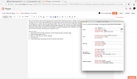
    This is what you're results should
    look like
    1 - Download the Font Finder extension on the Google Chrome extension page
    2 - Once it's been added, click it
    3 - Hover over the text you want to identify
    4 - Click the text!
    5 - A tab should open up giving you all the specifics and results!


    Was it Easy?

    I'm gonna be honest. When I first added this extension, I had no clue how to use it and nothing was working for me. I clicked it, and nothing happened, so I assumed it was broken and maybe my school server had it blocked. No big deal. But then, I clicked it once more to see, and surprise, nothing happened. But I then moved my mouse over to the text and clicked and all of a sudden my stats came up! So if this happens to you, don't be scared and just go for the text. Other then that little hiccup, I think this tool is pretty easy to use and will come in handy for future projects.

    Want to Download This Extension?

    Font Finder - Google Chrome Web Store

    Tuesday, May 16, 2017

    HomePage Makeover

    My website

    What assignment is this?

    For this weeks assignment, we had to pick a high school logo that wasn't too pretty and take inspiration from another source to make it better. Then eventually make a homepage about it! I originally started out with Shawnee Mission South, then changed to just the Shawnee Mission School District site. I picked it because it was basic colors I could experiment with and incorporate it in many ways. I took after the Coldstone Creamery logo. I had a little over a week to do it. I started off really frustrated and took many different logos from restaurants and shops and recreated SMS logo into that, but wasn't thrilled with any of them. I eventually completely scratched everything and started over on both my high school logo and my store logo. I found that much easier and went through the rest of the project with ease. When it got to the website, I took a bootstrap template (which is super frustrating and I probably won't do it again even though it looks really cool).

    What Did I Learn?

    Original website
    Along the way, I learned that you have to do a few drafts before getting to the final product. I got to have a refresh with Illustrator in this project too, which was really nice, especially since it's been a while since I've done a project with it. Specifically with this project I had a fear of the deadline. As it got closer and closer, I realized I had more to do then I realized, and add not knowing how to use bootstrap on top of that and it's just a mess. But in the end, it all turned out okay and I 'm happ

    y with the way my site turned out (especially for my first bootstrap!). I will draw the experience used with bootstrap to create better websites in the future and knowing how to use those tools to enhance the project. Overall, I really liked this project and I would do it again for other websites.

    My Homepage

    Monday, January 9, 2017

    Flash

    When reading Gone in a Flash written by Keith Collins, flash became more then just a plug-in to me. It was just something that I needed in order to listen to pandora at the time. Reading this article, it gives a clear, detailed explanation of what flash has been through. From roaring success all the way down to being replaced, Flash has been through it all. The author concludes that HTML will be a suitable replacement for Flash, with multiple versions and enough complexity to to have long-term suitability.

    Flash brought together the web community in ways that didn't seem possible at the time. It made the possibility of being able to access websites on all different browsers and still work properly a reality. The plugin guaranteed videos, animation, and interactivity onto every single computer. In 2007, Steve Jobs made the executive decision to not support flash in the latest updated iPhone. This prompted others to move away from flash as well and use HTML5. Facebook and Youtube used flash to build their games and videos, but eventually did make videos available in HTML5 as well so iPhone users could participate. In 2011, Adobe released Edge Animate - a new way to create HTML content, which was universally supported on most devices. "This makes HTML5 the best solution for creating a deploying content in the browser across mobile platforms" said Adobe. The major company that uses flash is Facebook. All of their games are based on flash and it's needed to play. Then, Google came out with the announcement that Chrome will block flash by default. You're still able to access it with an optional button, but for the most popular browser in the world to get rid of it, I don't see a bright future for flash.

    As a web designer, I use HTML 10x more then I ever did Flash. It's the base of all my websites, while flash is more of an optional tag on. I don't understand how Flash could've been the base of anything. Even before iPhones wouldn't allow flash, there wouldn't of been a great use of it. All together, Flash is something that is just there, and I don't think it would make much of a difference if they got rid of it all together (unless Pandora doesn't upgrade).

    Here's the link to the article: Gone in a Flash