Tuesday, December 20, 2016

Hop Aboard the Christmas Express!

For Christmas this year, I've decided to make a Christmas Express page. In the beginning, I had a really hard time coming up with a topic and took many many polls to see what people were most interested in. Some ideas that didn't make the cut were millennial santa, christmas memories, and best wacky christmas foods. Finally, I decided to just make a general Christmas website. I'm an avid watcher of movies and TV shows, so I thought why not name of the best ones I've seen. My teacher, Mr. Olson, said another cool idea would be to name the weather throughout different cities. I had a really fun time researching all of that, and I found that none of the cities I researched are having snow on Christmas, which is just plain sad.

Since we upgraded to Dreamweaver CC this year, this project let me explore some of the new aspects of Dreamweaver. Last year, I always used the automatic way to insert CSS, this year I find myself manually inserting things into the code, and that helped me learn so much more that goes on the background of my website and what exactly is in it.

Although this is one of my favorite websites I've done, I would change my homepage as well as my pictures. I need to spend more time fixing them and making them more responsive. For my homepage, I need to find more things to fill it up. I was thinking of making a pie chart to show everyone's favorite Christmas memory, but couldn't find one that looked right, especially since I had such little content. One of my favorite things I learned this semester was the depth backgrounds. I think it adds really great color. I did candy canes for this website, and have heard nothing but great feedback. I also made the container transparent so you could see the candy canes through the text, which makes it look more professional.

For my next project, I'll keep manually entering the code in because I think it helps me learn a lot and makes the website better, don't know how, but it does. believe me. This is overall one of my favorite websites because Christmas is my favorite holiday and it got me in such a big Christmas mood.

Happy Holidays!

Thursday, November 10, 2016

Beware the Jabberwocky!


I love Alice in Wonderland. It's just a simple fact. It ties back to the fact that I love typography. I had never heard  of Google Fonts before this project, and I'm happy to say it was so easy to use my great great grandma could use it. I started my Jabberwocky site with a completely different idea in mind. I didn't have a left border on my poem, I didn't have a right border on my sidebar, and it was a mess. I don't recommend, it looks as if they're going farther and farther away and it's not even apart of the same website. Not sure what I was thinking, but I got my gears working and fixed some of those issues.

I had no clue that I could imbed fonts into my website, and I find that the coolest thing I've ever learned in my history of website learning. I will defiantly use this tool for most, if not all, of my future websites. I think it makes things so much easier and makes the website come to life compared to the generic fonts that Dreamweaver gives you.

Wednesday, October 12, 2016

Melody Baker: The College Experience

Former Olathe Northwest student Melody Baker came in and we asked her some philosophical questions to see if college is really what it sounds to be.

1. How is dorm life?
Throughout the 30 or so minutes I got to talk to Melody, I surely did not expect what she was to say next. "Don't have floor sex". While I wasn't exactly associating college with that, I guess it's good advice. She also stated to get along with your roommates, because the last thing you want to do is get in a fight with the people you're living with for the rest of the year, and possibly more upcoming years.

2. How does web design apply to your major?
Melody unfortunately didn't major in web design, but she said the experience really did help her deal with the idiots around campus.

3. What is the overall college atmosphere like?
Melody stated that the classes at Washburn University were overall really small (about 15 people), and you have a lot more freedom but don't try and overuse it because you'll end up regretting it. You also end up having really great one-on-one time with your professors.

4. An average Monday, Wednesday, and Friday looks like this: 9-9:50 class, 10-10:45 nap, 11-1 class, and then she has track practice for the rest of the day.

And repeat!

Friday, October 7, 2016

Krug Ch3

Penny Juice - This website has very extensive background noise because they changed the color every inch of the website and I don't know where my attention is supposed to go.

Being Wicked - This website shows a very low amount of competing noise because they pretty much just chose one color and went through with it for the whole website.

Web Pages That Suck - Okay so I went to this website to find a website that wasn't clickable but it turns out this is one. There's ads in the middle of sentences and the content was all over the place, and there's some images that look like they might be apart of the page but they're actually not and you couldn't click on them at all.

Club Penguin - This is one of my favorite websites design wise because they make it easy to see what's clickable. They put borders around it and it's a bigger font than some of the other text.

Belle De Soto - This site might be the scariest thing ever. I can't even describe it, but I KNOW there is no defined areas whatsoever.

Vanderbilt University - This website does a really good job of dividing up the information that's offered and it's easy to read and find what you need quickly.

Forever 21 - When shopping on this site, it's very easy to just click on the logo (which happens to be in the top left corner!!!) and it'll take you back to your homepage.

What is Blick - This website straight up showed me what it was as soon as the page loaded. It's clear with it's claims and it has great visual hierarchy.

Wednesday, October 5, 2016

Don't Make Me Think!

My question is what my eye should go to first. In some cases, it's okay to add a picture at the top of the page but only if it's a slideshow, and it had padding at the top. It also makes me question whether my screen is frozen or not. The information and links at the bottom should be bolder or bigger, but I don't really notice them when I first look at the site, even though that's very serious information that needs to be seen by everyone. Also, toward the bottom of the page, there's a live twitter feed and the images are blank and makes me question once again if my computer is frozen.


Is that advertisement? Where's the navigation bar? Can I search for something? I'm gonna be honest, it took a couple of minutes looking at this to find the play button because everything was so big and colorful and it's small compared to the rest of the page. There isn't any information of what Webkinz is, and only thanks to my childhood do I know what to do. Also, my eyes saw the advertisements before anything else. They're in the way of the home page, and if you're going to do advertisements, don't do them in front of everything else.


This picture doesn't serve justice. The cat is actually actively typing on the computer. I'm questioning whether is website is ACTUALLY affiated with Yale University and who let them do this. I don't know what to do when I look at this. My eyes just kinda look into blank space, which is the worst possible sign that this website sucks. Apparently there's links on the sidebar, and I'm kind of scared to click them to we're going to leave that a mystery and do what question marks are known for, leave the website.

Monday, September 19, 2016

19 Anteater's Logo


For this project, I created a business called 19 Anteaters, and it's a family owned farm that breeds anteaters. For this project, we had to create a logo and record our progress. First, I tried just a simple logo that had a solid background and had the words 19 Anteaters tracing around the edges of the shape. It's much like what you see on the bottom on top of the letterhead, just without the name of the business. Eventually I tried creating outlines of different anteaters and replicated them to make them seem like they're dancing, and I thought that was a fun way to show our different anteaters, and that not all anteaters are boring animals that eat ants all day (but I guess that's what people assume from the name?). Finally, I love light rustic wood. So I searched an image and created a clipping mask with my original anteater, and tested out a few different fonts, and I got my logo! My peers agreed that it was in fact the best one I had created. Now that I've decided on my logo, my teacher assigned to put your logo on different types of objects such as storefronts, business cards, letterheads, a phone app, an envelope, and a billboard. I got to use different forms of my logo and put them on all of the different types of objects, even though I may use my wooden logo for my website.


Monday, September 12, 2016

Steal Like an Artist Review

If you look to the right, I stole that picture. It's not mine, I didn't make it, and I sure didn't check the "free to use for use" setting on Google, so therefore I stole that picture. After reading the first chapter of Austin Kleon's Steal Like an Artist I learned that being a designer was more then just being creative. Kleon went over the fact that nothing is original, and everything you make is just stolen from someone else. There was a quote I really liked in the book, "What is originality? Undetected plagiarism" -William Inge. I feel like this quote summarizes this chapter very well, considering it's everything from genetics to always reading. Kleon also stated to always carry a pen and paper with it, because you never know what you'll see. I get a creative block quite a lot, so I feel like this tool would be handy considering I could just pull out my paper and see what creative ideas I might've gotten in the past. Overall, I will use the strategies in this book for all my future projects (If you click the image, you can buy me this book for Christmas!! :)))))

Friday, September 2, 2016

Project Proposal

Mineral: Ruby
Animal: Anteater
Letters: A, F
Number: 19

For my company name, I came up with "19 Anteaters", which is a family owned farm that breeds anteaters, which is located on Ruby and Farner. This is targeted toward families or other farmers looking to purchase anteaters. Our anteaters are fed the best source of protein, Science Diet. It helps reduce fleas as well as allergies, to help keep your future anteater

Monday, August 22, 2016

Adobe Photoshop CC Tutorial

In honor of school starting, and the process of switching to Adobe creative cloud, I decided to create a tutorial for a new tool in Adobe Illustrator (and so I can get a grade in this class). For this tutorial, I decided to do 3D text, which was a lot simpler than I thought it would be so I think you all shouldn't have a problem with it.

First things first, to create the document. Now the sizes I listed to the left aren't necessarily the sizes that you absolutely have to use, you can pretty much use any size you want as long as it fits your text, but keep in mind that the bigger the document, the longer the process will take.


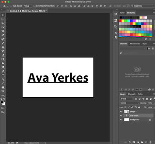
This is the text I chose, I simply just did my name and I put a line shape underneath it so the 3D text will pop more. Next you're going to right click on the text layer and click "convert to shape". This should outline your text and now you can click on the text layer as well as the shape layer and merge them together using command E. After that, right click on the layer and all the way at the bottom it should say  "New 3d extrusion from selected layer". Click that, and it should look like the picture below.


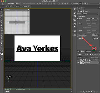
 Now that we've converted to the 3d layer, we're going to experiment with the 3d tab and the layers so read carefully. You're going to go back to the layers panel and right click on background, then go all the way to the bottom and click postcard. All this does is put the background behind the 3d layer. Next, you'll combine the background and the text layer together and you should get the next picture below.


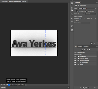
After that, you can experiment with the 3d layers and figure out how you want your text to show up, but all I did was lower the extrusion depth slightly. Now you're going to click the cube in the properties layer (picture on the left) and it should start to render your layer, so it gives off the effect that really pops your 3d text. This process usually takes around 5 minutes for me, but again it depends on how big your document is.


Now this is your final product! Feel free to change any colors of the size or your text, but this is what I ended up liking the most. Thanks for reading!


Monday, May 9, 2016

FINAL reflection

Individual Focus


For my individual project, I chose to make a face out of text. I found a tutorial online and made different artists. For my process, you start off tracing the image and putting it on a new layer. I then copy and paste text, and create 20-30 different layers and made them all into a smart object. Then you make another layer of the original image, and selecting a linear burn, and turning the smart object back on and it looks like this.

eMagine


Carton Skills


For my carton design project, I was partnered with Julia and we created MelaTAN, which is a pill you can take to make yourself tanner.

Movie Poster

For my poster, I chose to do The Intern because it's a newly released movie and I feel like there's a lot of different elements I could use to create the effect I wanted. I feel like the font, the tie, and the briefcase really sums up the movie well without knowing what it's about.

Magazine Cover

This is my magazine cover, I chose to do dog fancy because I'm obsessed with my dog and I liked that pictures that turned out. My process included resizing the text and changing the colors in Illustrator and moving them over to inDesign to put all of the text and images together.

Wednesday, April 6, 2016

My Photo Composition Site

This is my Photo Composition site and in this site I stated all the rules of Photo Composition and took pictures to give an example of each rule. I really liked this project because I love photography and I got to find different spots within town that I've never come across before. I made a responsive version of this site, which is the last picture, and my Mac n' Cheese site is also responsive and I got to take another path for this tutorial then I did for my Mac n' Cheese site, which was really interesting. If I had to do anything different, I would look into different pictures for my header and spending more time on my header to make sure it matches my color scheme. What I really like about this site is the strokes on the sidebar, header, footer, and main because I think it gives a really cool effect throughout the site.

So what is responsive Web Design? Basically, having a responsive website just ensures that if you're using a tablet, mobile phone, or any other different sized screens, that your page will change to make it easier to see all your content, pictures, and other links. This is a very important process of making a website. When putting it together, you put a "media queries" in the top of your source code on all your pages so that it applies when you go to upload it to your server. Breakpoints occur when your making the page small and it gets to a certain size where your sidebar and images get small or move around your text. In my last screenshot, notice that my side bar goes to the bottom of the page.

I've also found a responsive website, and you can see that as I go smaller, the text starts getting smaller and the email request box is now stacked. I think they did a great job with keeping everything the same size so we can still see it and it's the same information.


Here's a link to my responsive Photo Composition site:
Photo Composition Site

Here's a link that goes back to my project page:
Ava's Index Page 


Monday, February 29, 2016

Touch of Fun Mock-Up Website


In this project we chose to screenshot a website of our choice and recreate it with a new topic and images using Adobe Illustrator. I chose this layout for my mockup website because it was simple yet it still gives the same amount of information as any other website. What I really liked about this website is how different it is compared to some other websites. If I could do something different next time, I would find pictures that have a different background color, like the original website, just to make it a little more modern and interesting.

Wednesday, February 10, 2016

Illustrator Projects

I made these 3 projects using Illustrator and Photoshop. During the first project (1st picture) I used the pen tool and made my own brush pattern to create different style lines and patterns.
The second project (2nd picture) We used the gradient mesh tool, and if I were to do this project again I would learn how to use that tool properly as well as the clipping mask and the direct select tool. We made our name look like a blueprint of a project and made different lines and arrows using shapes and made our names look more like a chalkboard.
The 3rd and final project (3rd picture) was my favorite. We got to create a mascot roly-poly icons using Illustrator and I really liked this project because you get to make cute little icons and I got to learn how to make a simple gradient shadow as well as how to make it look like a 3D object.


Friday, January 29, 2016

Past Present Future Website

During this project, I learned how to make individual slices in photoshop and then save them and put them in a div in dreamweaver to make it look good and work good. I really liked this project because we got to discover new ways to use our server on internet exploer and make it presentable for both macs and windows computers.

You can find my full site below:
Past Present Future Website