Friday, December 18, 2015

Business & Post Cards


Here is my inspiration for my final. I really liked how in this design, they use different fonts and put them together. I added a couple snow flakes as my own design.
UPDATE:
Here's the printed version of my business card.

Monday, December 7, 2015

Personal Project

This is a project I did on my own in Illustrator and Photoshop. I created my type design in Illustrator using the Blend Options tool to create the lines coming down from the lines. I also used the arc tool to create the outer type. I really liked this project because I got to experiment with different fonts and how to make it look natural. I created the background by using Photoshop and putting a dark green layer above the picture and changing the opacity to give it a darker vibe, and to also make the text stand out more. To blend the picture and the green layer, I used a black and white gradient and multiple the green layer.

Wednesday, December 2, 2015

My Logos

This is the personal logo I made. I made different shapes and designs with this pattern until I came up with something that represented me. Some problems that occurred when making this was the overlay of the letters and how they can fit while having a normal amount of space between the letters. I really like how well the letters fit together and how the Y flows smoothly into the A.

Moving Mountains

With this project, I used photoshop to make the mountain appear as it's floating, and added in a couple other objects to appear as they're floating too. I also made it seem like all the objects have shadows. Some difficulties I had with this project was blending the cloud into the sky as well as cutting off the bottom of the mountain and pasting another piece of the mountain as the bottom.

Clipping Mask

I used the Clipping Mask in photoshop to create this design, and I got my favorite books and put them behind my text to give it an illusion that the letters themselves are books. This is defiantly one of my favorite projects because I like how you can put pictures behind the letters and make it have a natural, homey feel about it.

Tuesday, November 10, 2015

10 Questions and 10 Words

1. Do you like something simple or more complex?
2. Is there any specific colors you have in mind?
3. Do you want it to be something big and noticeable or small and subtle?
4. What's your vision for your logo?
5. What is your deadline?
6. What do you want the logo to say about you and your company?
7. What's your business about?
8. Are you going for something more serious or silly?
9. How do you want to make it something to remember?
10. What audience are you trying to appeal?

Friday, October 30, 2015

Professional Blog Review - Breaking Rules

So what are the rules of graphic design? The answer is simple, there are none. As a graphic designer, your job isn't to just create a product for someone. It's about pushing your own boundaries and expectations as well as your clients. It may have to do with testing your creativity limits and challenging your self to strengthen you weakness. Why create rules, when they're just going to be broken? When dealing with clients, it's almost necessary to make rules. It's good to have a general design decision and to make certain rules to avoid things with the clients. Denise Bosler, the author of the article Creativity Anarchy at Its Very Best, stated that "Never stop learning, never stop exploring, never stop doing what you love, and always create the best design you can".

Wednesday, October 7, 2015

My Motif & Repeat Pattern


During this project, I learned how to use the pattern tool, the rotate tool, and some new techniques on the stroke tool. Some troubles I had with this project was that I wanted to make a unique stroke but not something you couldn't understand. I put together a couple different designs and I put them together to make something unique and fun. For my motif, I got inspiration from looking at different designs on the internet as well as around the school. To put the rotate tool to good use, I made a simple design first and rotated it to make something like a flower.

Wednesday, September 30, 2015

Pattern Tutorial

Hey guys! Today I'll be showing you how to make a basic pattern on Adobe Illustrator.

1. Create an art board, and it's usually a good idea to make your width and height a square 
2. Just for this tutorial I'll make a basic shape and show you how to give it a paper effect. When making the star, press the ~ button in the top left hand corner of your keyboard, if you're on a mac. When you start to drag out, it should start to look like this.
3. Since this specific short cut is creating individual stars, select the whole pattern and group it all together, now we're time for the pattern making.
4. Select the shape and go up to Object > Pattern > Make
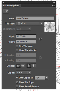
5. Illustrator will now take you to pattern mode and you can do a couple different things from here. As you can see on the picture to the right, this panel should come up when you go into pattern mode and first, of course, name your pattern so you can tell them apart.
6. Go to the drop down box in the tile type box and select brick by row, in the future you can choose any of these but for this tutorial I'll just be showing you this one. 
7. In the upper left hand corner of the pattern options box, you'll see a little button that looks like two boxes going away from each other. Click that and now a blue box should show up around your original pattern and you can change the size of that to determine how close or far you want your shapes to be from one another. In the overlap section, feel free to choose which one you would like to be on top of each other or behind each other.
8. You can then press done at the top of the page and the pattern should go away and the original pattern will be there. Select it, and move it out of the way so your able to show your new pattern. Create a normal rectangle on top of the art board and choose a fill color.
9. Over in the swatches panel, you should now see a little version of your pattern. Make another rectangle over the other one and click your pattern in the swatches panel and it should show up over the rectangle! 

I hope you guys enjoyed this tutorial! Happy pattern making!

Wednesday, September 23, 2015

HTML Colors!

Today we'll be reviewing Hexadecimal codes, RGB, and RGBa. All 3 codes involve colors, but can give them different forms or give them a different look, or also how much we control the shade of the color.

Hexadecimal Codes


Starting off with Hexadecimal codes, you can use letters and numbers, and they can either be 3 or 6 characters. It ranges from 0, being black, to 9 and then A to F, being white. Any of the numbers or letters in between can determine what shade of color you'd like, and usually the characters are in pairs and they can be either red, green, or blue and you can higher or lower the codes on those to establish different colors.


RGB & RGBa Codes


RGB coding involves no pound sign (#), no letters, 3 numbers, and it can go up to the number 255.You can use this for regular coloring, but if you want to add some transparency you can set your settings to RGBA. The only difference is that there are 4 numbers in RGBA, it can go up to the number 225, and the A at the end stands for alpha and is used to determine the transparency. It normally ranges from 0-1. Zero being see through and 1 being almost a completely white background. You can use the numbers in-between, such as 0.2 and 0.8, to determine how much you want to see through your box.


Above is what an RGBa code would look like, you can see the last number, the alpha, is a decimal and since I want my box to be partially see through, I made it a low number and the other 3 numbers just determine what shade I want the background to be.

We need this skill to make websites and we want to make a box with information in it, but have it show through to some pictures in the background. Anyone wishing to have maybe a slideshow in the background or a lighter feeling of their website should use this tool because they can still have information about their website on their page but at the same time being able to see the whole thing.

In conclusion, there are many different ways to use color codes and many different ways you can make them appear.

Below are some websites you can access to make you codes the best of the best:

HTML Color Picker
Color Explanations
RGB Color Channels

Friday, September 4, 2015

My Creative Objects


In my creative pencil, I made a couple different pencils before deciding what parts I liked best and put them together to make a pencil I really liked. My favorite tool was the pen tool because you can draw anything and then you can modify it any way you wish. In my honey and honeycomb design, I got inspiration from Winnie the Pooh and how much he loves honey, and it inspired me to make this honey jar. I used the paint brush tool to get the honey drip on the jar, as well as on the comb.


Thursday, August 20, 2015

What Is Graphic Design?

Graphic design. What is it? Why do people do it? How is it a part of our everyday lives? The great thing about graphic design is that it isn't just a job or something we like to admire. Graphic design is designing your imagination. Graphic design is making our thoughts become visible.

So why do people pursue it? What makes someone wake up one day and go to work as a graphic designer? I read a few blogs and watched a few videos, and I came up with a few answers for you. Graphic design, to me, is creating a moment people can understand and making people see past the product and seeing what's behind the design, and thinking about the product like it was going to be your own. It's about understanding the consumer and what they like or dislike and creating something that defines who they are, and maybe along the way we discover who we are in terms of graphic design and where we belong.


One of my favorite forms of graphic design is typography. I love the concept and the process and how it always looks different and means something else every time you look at it. Like the picture on the right, I love making and seeing things that are more than what they show, and showing a sentence hidden in the same words.


Psychology for Photographers

Like graphic design, photography is one of my many hobbies, and it can also be tied in or I can use my photos to influence my designs. The cool thing about graphic design is that it can be anything you want, it can be interior design, art, or even marketing. Any profession you do is probably going to have graphic design, and that's the joy of it. Even doing graphic design in high school really influences my thoughts and how I look at things, and I suppose that's what graphic design is. Creating, shaping, and changing the world.

Then and Now


This is Club Penguin 2005 vs 2015. Obviously, the layout has changed drastically and while they look quite similar, the 2015 version is a little big more detailed and gives the website more attraction, but the 2005 version gives more information on the home page and 2015 shows more of what it looks like inside the website. The coding used in 2005 used a lot more
and while the 2015 coding is more
and class coding.  


Webkinz 2005 vs 2015.  2005 was more of a click and go and basically showing you some of the things your pets can do, and the 2015 version shows more ads and merchandise and shows through slides what you can do inside Webkinz. The coding is different in that the 2005 version shows less options of where to go, therefore less coding, and the 2015 coding has more tabs and more links to click making a larger coding.


Skype 2004 was very... old. The buttons were robotic and while in the 2004 version, it gave a lot of information on what you could do, the 2015 version has more of a slide show, making it look more appealing to the eye while at the same time giving us the same information we would get from the 2004 version. They also changed the color concept from red to blue. The 2004 coding was more spacious and had lots of wording, and Skype 2015 was laid out to be more tight and while maybe it's the same amount of writing, it's not all at once, and gives us more understanding of what the software  can do.

Tuesday, May 19, 2015

Final Project - Shoe Fold


 This is the commercial I made, and during this process, everyone helped out and we put all of our editing features that we liked and put them together to make one with all of our ideas.


These are some of the pages I made for the website, I created the website itself and then wrote content for these pages. I was also in charge of reminding everyone of what they needed to do and things such as where and how to put their picture in the website.


This is the animation, I created the overall video and Delaney created the Shoe Fold shown in the video.


Our process was using all of our technical programs and created all different options that we liked and choosing the best one or making another one that fit different opinions throughout our team. Getting the idea together was something all of us had to do and once we had the main idea we all incorporated our thoughts and changed our idea until we thought it was suitable enough and something we could actually make. In the production process, we taped or made different versions of the commercial, animation, and logo in order to get the feel of the final choice. Along the way, I learned new ways to use our software and better ways to communicate with a bigger team in a bigger project, and it gave us the feel of what working with an actual work space would be like. Next time, I would definitely get more thoughts, whether its a teacher or another adult, and get suggestions on what would make them like the product better. I would keep our process the same because overall we worked well together and didn't have to make any harsh decisions. From this experience, I can definitely say that I would get more communication throughout my group next time I work on a project like this.

Overall, I loved this project because it gave us more experience and reminder with things we might've worked with before, but not on our own, and I'm glad we got to use the software in our own way and sort of figure things our ourselves with the occasional help from my team.

Friday, April 10, 2015

Shoe Fold Commercial


During the filming of this commercial, I learned that sometimes you have to take charge for some things to get done, no matter how mean you may sound. Working together as a group to create something bigger can be difficult in agreeing what your different visions might be in order to create the whole product. I also learned that when you put all your visions together, it can create something that you might end up liking in the end. It's also good experimenting with the different tools that we weren't maybe able to use while filming other projects. In order to keep everyone in your group in check, you sometime have to get them moving and help them out if they don't know how to place some things. You also want to get everyones opinion after filming to make sure everyone agrees on the final product. Next time, I would get multiple angles for each shot to see which one we like better.

Thursday, February 26, 2015

The Final Interview


This quarter in video has taught me many things. It's taught me collaboration, in which I got to work with other people, which we don't do much of in the other strands and it can teach us how to get along and to know what you're best in, as well as what other people are best in so they can help you. I also learned how to keep the video as a story and how to keep the viewers entertained and they know what's going on with the video rather than being confused as to what is happening. Our teacher also gave us the opportunity to act as if we were doing an interview when we presented our video and she gave us many opportunities to help enhance our videos and editing. Our videos got better each time as we were more familiar with the equipment and software, as well as having more help from our partners. Overall, this quarter in video taught me a lot that could help with future career opportunities and extra curricular activities.

Thursday, February 19, 2015

The Chase


In this video, I learned how to stop your video before someone goes off the screen, then pick up the next shot of the person continuing in the same spot they were in the previous shot. I also learned to get everyone involved and making sure they know how to use the camera and giving them tips on what they could do for their next project. To my next project, I'll help the director in stepping away from the camera and getting the right shots so there isn't any jump cuts. The collaboration in this project was different considering we had 3 people instead of 2 and we all had to talk together to get the correct angles and we know what to do in the shot. The collaboration will help me next time in getting people more involved and picking people to do the right job and making sure that they actually help us out.

Friday, January 30, 2015

Story Sequence


During this project, I learned different techniques and angles while using the cameras more efficiently. I also learned how to transition from one activity to another more smoothly and allow easier access to our angles. From my last video, I was a little shaky and I know now to walk away from the camera. It was easier this time to work with the actions seeing as we could move objects to get better shots and transition the cuts. Next time, I'll look at locations closer to each other and try to have more head room as well as foot room. I'll also pay more attention to the frames while filming next time. Collaboration is the action of working with someone to produce or create something. This was worked into our project by having two people working together, one behind the camera and one doing an action in front of the camera and working together to create something unique and something that you'll enjoy doing.

Thursday, January 22, 2015

Hobby Video


The 6 shots in the 6 shot system are:
-Wide Shot- Shows a little bit of sceanery behind the person
-Extra Wide Shot- Shows in full detail of the whole scene going on behind
-Close Up- Shows only your face, and cuts off any top and bottom space
-Extra Close Up- Shows the hands or feet in detail
-Medium Shot- Waist and up (How you regularly see people in a desk)
-Over the Shoulder- Gets a view from over the persons shoulder

I learned how to position and use the cameras correctly, as well as get good angles. For my next project, I'll apply the camera more carefully and try using a better space than what we had. Also, I would adjust the camera more carefully since I know better how to use it now. In addition, I'll go through the music more cautiously and try them in my video.

Sunday, January 11, 2015

Highlight Video


I learned the following tools in my highlight video:
-Command- C (Copy)
-Command- V (Paste)
-Command- B (Cut your video)
-Shift- Z (Compact timeline)
-Command- I (Import)
-Command- T (New tab)
-Space bar- (Play)
-Rewind- (J)
-Fast Forward- (L)

I chose gymnastics because I started it when I was 3, and never got fully into it, making it more of a hobby now rather than competing. I took interest into it because I saw all these girls on the Olympics doing all these cool flips when I was little and knew I wanted to be like them. Unfortunately over time, I lost interest in it and stopped for a couple years before I went back. Luckily I still had the same skills and didn't have to relearn them, and I still knew a couple people so it was easier to fit back into my normal schedule. Just very recently last semester, I made the decision to stop gymnastics and start with theatre, seeing as it was taking up my whole schedule. Every now and then I'll go to open gyms and improve my skills, but for now I'm going to stick to just watching.