Showing posts with label typograpy. Show all posts

Monday, August 22, 2016

Adobe Photoshop CC Tutorial

In honor of school starting, and the process of switching to Adobe creative cloud, I decided to create a tutorial for a new tool in Adobe Illustrator (and so I can get a grade in this class). For this tutorial, I decided to do 3D text, which was a lot simpler than I thought it would be so I think you all shouldn't have a problem with it.

First things first, to create the document. Now the sizes I listed to the left aren't necessarily the sizes that you absolutely have to use, you can pretty much use any size you want as long as it fits your text, but keep in mind that the bigger the document, the longer the process will take.
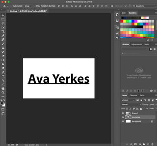


This is the text I chose, I simply just did my name and I put a line shape underneath it so the 3D text will pop more. Next you're going to right click on the text layer and click "convert to shape". This should outline your text and now you can click on the text layer as well as the shape layer and merge them together using command E. After that, right click on the layer and all the way at the bottom it should say  "New 3d extrusion from selected layer". Click that, and it should look like the picture below.


 Now that we've converted to the 3d layer, we're going to experiment with the 3d tab and the layers so read carefully. You're going to go back to the layers panel and right click on background, then go all the way to the bottom and click postcard. All this does is put the background behind the 3d layer. Next, you'll combine the background and the text layer together and you should get the next picture below.
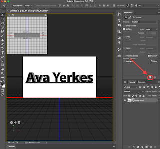


After that, you can experiment with the 3d layers and figure out how you want your text to show up, but all I did was lower the extrusion depth slightly. Now you're going to click the cube in the properties layer (picture on the left) and it should start to render your layer, so it gives off the effect that really pops your 3d text. This process usually takes around 5 minutes for me, but again it depends on how big your document is.
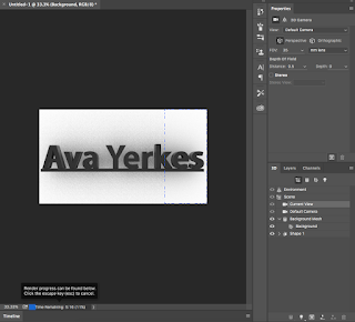


Now this is your final product! Feel free to change any colors of the size or your text, but this is what I ended up liking the most. Thanks for reading!


Monday, May 9, 2016

Individual Focus


For my individual project, I chose to make a face out of text. I found a tutorial online and made different artists. For my process, you start off tracing the image and putting it on a new layer. I then copy and paste text, and create 20-30 different layers and made them all into a smart object. Then you make another layer of the original image, and selecting a linear burn, and turning the smart object back on and it looks like this.

Movie Poster

For my poster, I chose to do The Intern because it's a newly released movie and I feel like there's a lot of different elements I could use to create the effect I wanted. I feel like the font, the tie, and the briefcase really sums up the movie well without knowing what it's about.

Magazine Cover

This is my magazine cover, I chose to do dog fancy because I'm obsessed with my dog and I liked that pictures that turned out. My process included resizing the text and changing the colors in Illustrator and moving them over to inDesign to put all of the text and images together.

Monday, February 29, 2016

Touch of Fun Mock-Up Website


In this project we chose to screenshot a website of our choice and recreate it with a new topic and images using Adobe Illustrator. I chose this layout for my mockup website because it was simple yet it still gives the same amount of information as any other website. What I really liked about this website is how different it is compared to some other websites. If I could do something different next time, I would find pictures that have a different background color, like the original website, just to make it a little more modern and interesting.

Friday, January 29, 2016

Past Present Future Website

During this project, I learned how to make individual slices in photoshop and then save them and put them in a div in dreamweaver to make it look good and work good. I really liked this project because we got to discover new ways to use our server on internet exploer and make it presentable for both macs and windows computers.

You can find my full site below:
Past Present Future Website


Thursday, January 7, 2016

Topic Website - KC Mac n' Cheese


The main idea of making this project is for me to get a broader perspective of using Dreamweaver, as well as all the features it has that can embed a video, graphic, menus, and certain rollover images.

When I first started this project, I thought of making a website about Broadway or Photography, one of my many hobbies after school. In the end, I decided to go with something that made me happy and I could find plenty of information on. Along the way, I learned many new ways to add in coding, different color schemes, plenty of new information on Mac n' Cheese, and embedding images and videos.

Next time, I might try to find a better place to put the side bar so the website looks more natural, as well as changing the background on the sidebar. I really liked how I made the logo, and I tried to make it in a Mac n' Cheese shape, but ended up choosing a fun font to incorporate the feel of fun and lovable Mac n' Cheese. I also really liked how I did the background around the whole thing with the transparency, except maybe I next time I might try to make the Mac n' Cheese more at the top and then fade into black.

This project definitely helped me learn how to do width and rounded corners that I will most defiantly use for future projects. I think I'll change the layout more next time and try to experience some new feature with Dreamweaver that I haven't tried yet. I really loved this project because we got to incorporate everything we've learned and I got to write about something that I'm passionate about. Check out all my pages, as well as the website it self with the link below!

Ava's Biography


Friday, December 18, 2015

Business & Post Cards


Here is my inspiration for my final. I really liked how in this design, they use different fonts and put them together. I added a couple snow flakes as my own design.
UPDATE:
Here's the printed version of my business card.

Monday, December 7, 2015

Personal Project

This is a project I did on my own in Illustrator and Photoshop. I created my type design in Illustrator using the Blend Options tool to create the lines coming down from the lines. I also used the arc tool to create the outer type. I really liked this project because I got to experiment with different fonts and how to make it look natural. I created the background by using Photoshop and putting a dark green layer above the picture and changing the opacity to give it a darker vibe, and to also make the text stand out more. To blend the picture and the green layer, I used a black and white gradient and multiple the green layer.

Wednesday, December 2, 2015

My Logos

This is the personal logo I made. I made different shapes and designs with this pattern until I came up with something that represented me. Some problems that occurred when making this was the overlay of the letters and how they can fit while having a normal amount of space between the letters. I really like how well the letters fit together and how the Y flows smoothly into the A.

Clipping Mask

I used the Clipping Mask in photoshop to create this design, and I got my favorite books and put them behind my text to give it an illusion that the letters themselves are books. This is defiantly one of my favorite projects because I like how you can put pictures behind the letters and make it have a natural, homey feel about it.

Tuesday, November 10, 2015

10 Questions and 10 Words

1. Do you like something simple or more complex?
2. Is there any specific colors you have in mind?
3. Do you want it to be something big and noticeable or small and subtle?
4. What's your vision for your logo?
5. What is your deadline?
6. What do you want the logo to say about you and your company?
7. What's your business about?
8. Are you going for something more serious or silly?
9. How do you want to make it something to remember?
10. What audience are you trying to appeal?

Thursday, August 20, 2015

What Is Graphic Design?

Graphic design. What is it? Why do people do it? How is it a part of our everyday lives? The great thing about graphic design is that it isn't just a job or something we like to admire. Graphic design is designing your imagination. Graphic design is making our thoughts become visible.

So why do people pursue it? What makes someone wake up one day and go to work as a graphic designer? I read a few blogs and watched a few videos, and I came up with a few answers for you. Graphic design, to me, is creating a moment people can understand and making people see past the product and seeing what's behind the design, and thinking about the product like it was going to be your own. It's about understanding the consumer and what they like or dislike and creating something that defines who they are, and maybe along the way we discover who we are in terms of graphic design and where we belong.


One of my favorite forms of graphic design is typography. I love the concept and the process and how it always looks different and means something else every time you look at it. Like the picture on the right, I love making and seeing things that are more than what they show, and showing a sentence hidden in the same words.


Psychology for Photographers

Like graphic design, photography is one of my many hobbies, and it can also be tied in or I can use my photos to influence my designs. The cool thing about graphic design is that it can be anything you want, it can be interior design, art, or even marketing. Any profession you do is probably going to have graphic design, and that's the joy of it. Even doing graphic design in high school really influences my thoughts and how I look at things, and I suppose that's what graphic design is. Creating, shaping, and changing the world.